The Google Material 3 Expressive design language, first announced in May, is gradually appearing across Google’s core apps. This redesign highlights modern containers, pill-shaped buttons, fluid animations, and dynamic backgrounds. It aims to unify the Android app experience with a more consistent and touch-friendly interface.
Apps Rolling Out with Google Material 3 Expressive
Several Google apps are now receiving the Material 3 Expressive update.
- Google Drive: Introduces a search app bar and a container view for grid and list layouts. Switching between options feels smoother and faster.
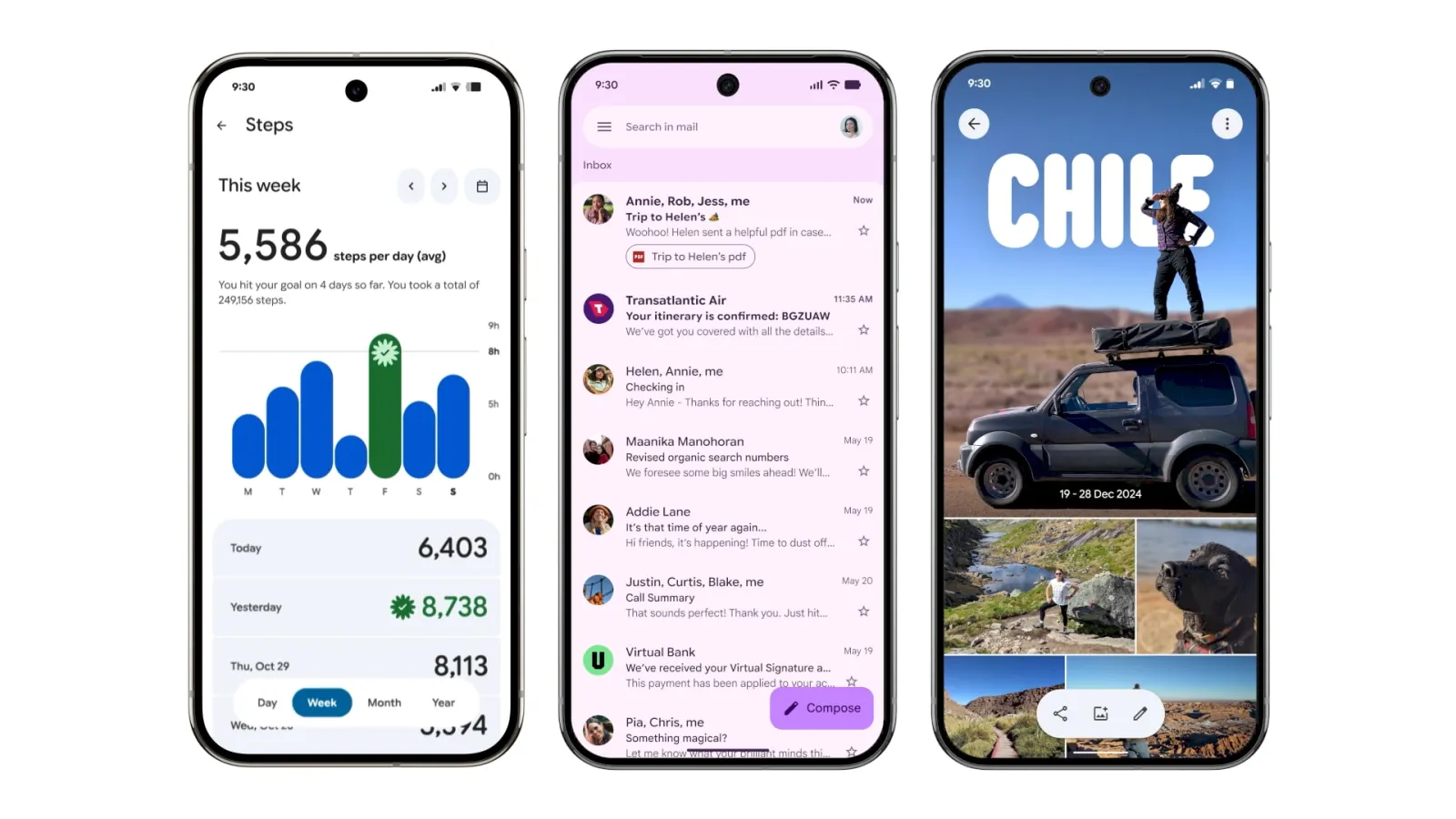
- Gmail: Uses a thicker search app bar, moves the menu outside the field, and adds pill-shaped swipe animations for gestures.
- Google Wallet: Cards appear thicker, while tap-to-pay includes a new animated success effect. Pixel users also get a new overlay when using double-tap power gestures.
- Digital Wellbeing: The dashboard gains containers and a thicker donut graph. These updates arrive through beta version 1.30.x.
- Google Photos: Features a dynamic backup indicator, expressive pull-to-refresh shapes, and a wavy progress bar during uploads.
- Google One: Switches to a shorter bottom bar and more prominent containers. Infographics are gone, resulting in a cleaner layout.
- Phone by Google: Gets a major overhaul. The bottom bar shrinks to three tabs, while a new keypad replaces the floating button. In-call screens now feature larger touch buttons for better accessibility.
- Google Keep: Adds a thicker search bar and reorganizes note tools into containers. The design feels more structured and easier to navigate.
- Google Messages: Conversation threads and menus now sit in rounded containers. Options in the “plus” menu appear in pill shapes for consistency.
Apps Already Launched with Google Material 3 Expressive
Some apps have fully transitioned to the Google Material 3 Expressive design.
- Google Contacts: Simplifies the interface with containerized layouts, a shorter bottom bar, and updated color accents.
- Google Calendar: Replaces faint slot lines with bold rounded containers. The background also adapts with Dynamic Color, improving clarity.
- Google Docs, Sheets, and Slides: Editing screens adopt expressive loading indicators and pill-shaped buttons. The format panel is cleaner and easier to use.
- Google Meet: Was the first to roll out Material 3 Expressive widely. Calls appear in tall container cards, while pre-call screens use oversized pill-shaped buttons.
Why Google Material 3 Expressive Matters
The Google Material 3 Expressive approach emphasizes consistency, accessibility, and personalization. For users, this means faster recognition of key actions and easier navigation across apps. In addition, animated elements and pill-shaped buttons create a more intuitive, human-like interaction style.
Moreover, the redesign builds upon Material You, Google’s broader personalization framework. Dynamic color themes extend across apps, ensuring a uniform yet flexible design system. Therefore, whether users open Gmail, Photos, or Keep, the interface feels familiar but expressive.
Conclusion
The Google Material 3 Expressive redesigns are transforming how users interact with everyday Google apps. From Gmail’s swipe gestures to Wallet’s animated tap-to-pay, each update adds visual clarity and smoother usability. As these redesigns expand to more apps, Android users can expect a unified look that balances modern aesthetics, usability, and expressive design.


